Let’s be real for a second: you didn’t start an HVAC company or a landscaping business because you wanted to spend your weekends obsessing over hex codes and "visual hierarchy." You started it because you’re damn good at what you do, whether that’s fixing a furnace in a blizzard or turning a patch of dirt into a backyard paradise.
But here’s the cold, hard truth: your website is your digital storefront. If it looks like a junk drawer where someone dumped a bunch of text and blurry photos, potential customers are going to back away slowly and call the guy down the street instead.
At CFGROOVE, we see small business owners making the same layout mistakes over and over again. These aren't just "ugly" design choices; they are literal lead-killers. The good news? They’re fixable.
Here are the 7 biggest layout blunders we see and how you can fix them to actually start getting more "Book Now" clicks.
1. The "Wall of Text" (Content Not Broken Into Blocks)
We’ve all seen it. You land on a site, and it’s just paragraph after paragraph of text. It looks like a high school history textbook. Your brain immediately says, "Nope," and you hit the back button.
The Mistake: Cramming all your information together without clear visual separation. This overwhelms visitors. They don’t want to read your life story; they want to know if you can fix their leaky pipe.
The Fix: Think of your website like a sandwich, everything needs its own layer. Break your content into logical blocks. Use different background colors (like a light gray block followed by a white block) to signal to the reader’s eye that "Hey, this is a new topic!"
Aim for about 120-180 pixels of "padding" (that’s designer-speak for empty space) between these blocks. It gives your message room to breathe.
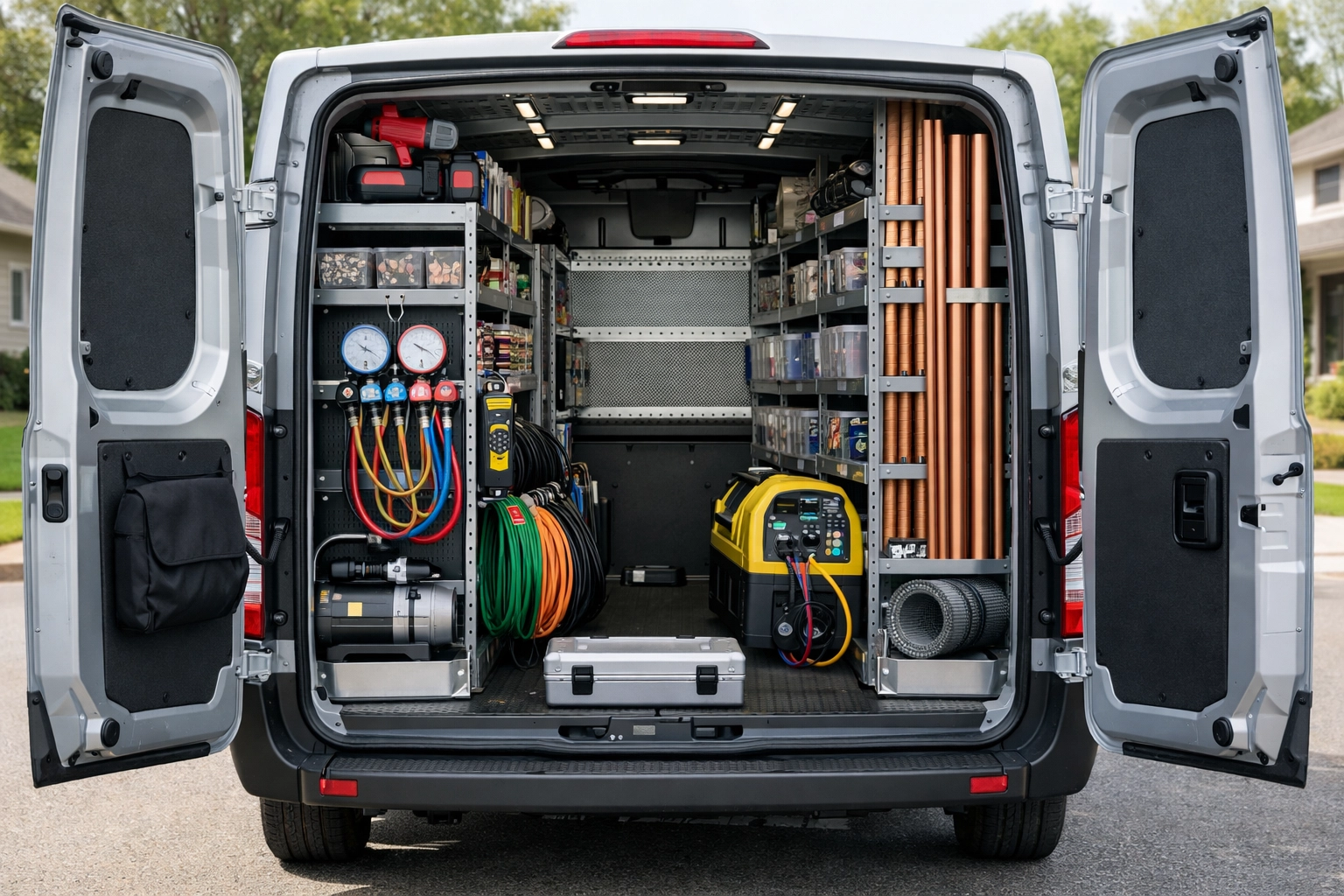
A high-quality photo of a clean, organized HVAC van with tools neatly arranged, symbolizing order and clarity.
2. Inconsistent Spacing (The "Wobbly" Look)
If you’re a landscaper, you’d never install a fence where the posts are 4 feet apart, then 6 feet, then 2 feet. It would look like a drunk person built it. Your website is no different.
The Mistake: Using random amounts of space between your sections. Maybe your "About Us" section is right up against your "Services" section, but then there’s a massive gap before the "Contact" part.
The Fix: Consistency is king. If you use a certain amount of space at the top of a section, use that same amount everywhere else. This creates a sense of professional rhythm. When your site looks organized, customers subconsciously trust that you are organized.
Check out our web design services to see how we handle this: it’s all about making the journey from "visitor" to "customer" as smooth as possible.
3. The Overcrowded "Junk Drawer" Layout
You know that drawer in your kitchen? The one with the old batteries, a stray rubber band, and a manual for a toaster you threw away in 2012? That’s what many small business websites look like.
The Mistake: Trying to put everything "above the fold" (the part of the site you see before scrolling). You’ve got three pop-ups, five different font styles, and a blinking "Sale" button all fighting for attention.
The Fix: Embrace the "white space." White space isn't wasted space; it’s an active choice to keep the visitor focused on what matters. If everything is screaming for attention, nothing gets heard. Pick one main goal for each page: usually getting them to fill out a form or call you: and clear out the clutter around it.
4. Weak Visual Hierarchy (Playing Favorites)
Imagine a newspaper where every single word was the exact same size and boldness. You wouldn’t know where the headlines are or what the most important story is.
The Mistake: Making all your text look the same. If your "Contact Us" button is the same size and color as your "Terms of Service" link, you’ve got a problem.
The Fix: You need to tell the visitor’s eyes where to go. Your main headline should be big and bold. Your subheadings should be slightly smaller. Your body text should be the smallest.
Most importantly, your Call to Action (CTA) should stand out like a sore thumb (in a good way). Use a high-contrast color that isn't used anywhere else on the page for your "Get a Free Quote" buttons.
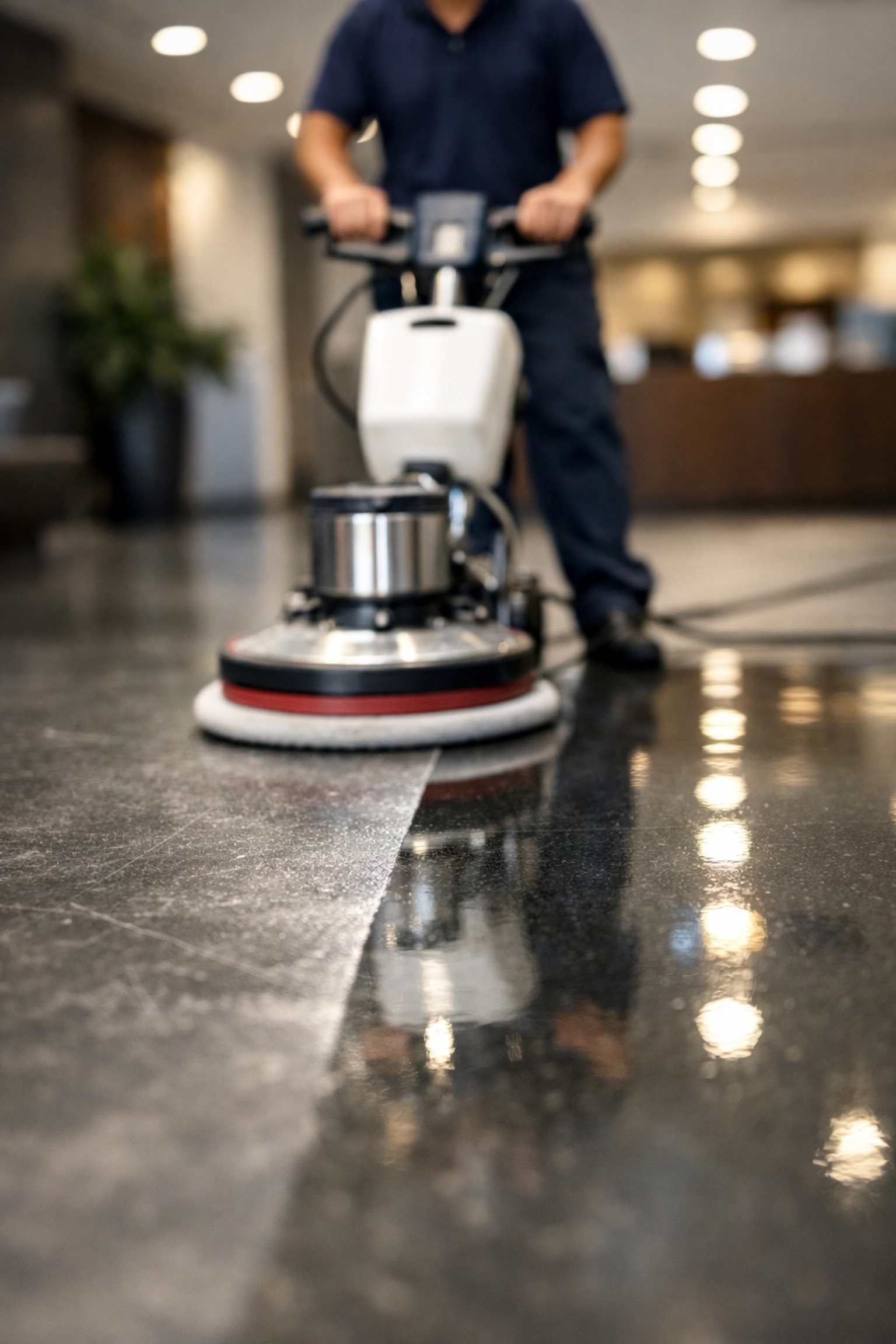
A professional cleaning crew in action, showing a "before and after" style focus on a specific, clean area to represent visual hierarchy.
5. The "Where Am I?" Navigation
If a customer walks into a hardware store looking for a hammer, and the signs point to "Mystical Metal Sticks," they’re going to leave.
The Mistake: Getting too "clever" with your menu names or having way too many options. If your navigation menu has 12 items, people are going to get paralyzed by choice.
The Fix: Keep it simple. Use standard terms like "Services," "Gallery," "About," and "Contact." Group similar pages together. If you have 10 different types of plumbing services, put them under one "Services" dropdown menu.
The goal is to get a lead to the info they need in as few clicks as possible. If you're wondering why people are leaving your site quickly, it might be time to check your navigation and lead flow.
6. No Breathing Room Between Related Items
Sometimes, we see websites where the headline is practically sitting on top of the paragraph below it. Or an image is so close to the text that they’re basically dating.
The Mistake: Not giving related elements enough padding. This makes the site feel "tight" and stressful to look at.
The Fix: Follow the "60-75-120" rule. Give at least 60 pixels of space between a headline and the text below it. Use 75-120 pixels around big images or standout boxes. This makes each element feel intentional.
For small business owners, this small change can make a site go from "amateur" to "established pro" overnight.

A landscaping professional pointing at a well-designed blueprint on a clipboard, representing the importance of a good plan and proper spacing.
7. Too Many Competing Design Elements
We get it. You want your site to look cool. But adding five different fonts, three different video backgrounds, and every color of the rainbow is like putting a spoiler, a lift kit, and neon lights on a work truck. It’s just too much.
The Mistake: Using too many styles. It confuses the visitor and makes your brand look disorganized.
The Fix: Stick to a simple "style guide." Pick two fonts: one for headings and one for reading. Pick a primary color (like blue) and use a couple of shades of it.
The most successful service-based websites are the ones that stay out of their own way. They let the work: the clean lawns, the fixed roofs, the shiny floors: be the star of the show.
Why Custom Beats Templates Every Time
A lot of the mistakes we talked about happen because people use "cookie-cutter" templates. These templates are built to look "okay" for everyone, which means they aren't great for anyone. They often come with rigid layouts that make it impossible to get the spacing or hierarchy right for your specific business.
At CFGROOVE, we don’t do templates. We build custom, template-free designs that are literally engineered to solve these layout mistakes before they even happen. We understand the "service-based grit": the hard work you put in every day: and we think your website should work just as hard as you do.
Whether you're looking for web design in Denton or need a total digital overhaul for your Dallas-based trade business, we’ve got your back.
Stop Losing Leads to a Bad Layout
Your website should be your best salesperson, not your biggest headache. If you’ve got a hunch that your layout is scaring people away, let’s fix it.
Ready to turn your website into a lead-generating machine?
- Book a quick chat: Grab a 30-minute slot on my Calendly
- Shoot me an email: chase@cfgroove.com
- Learn more about us: Visit CFGROOVE.com
Let's build something that actually works for your business. No fluff, no stress: just results.