If your homepage isn't bringing in new leads while you sleep, it’s probably because you’re making one of seven common mistakes: talking about yourself too much, hiding your contact buttons, or moving slower than a turtle in peanut butter. To fix it, you need to flip the script, put your customer's problems front and center, clear out the clutter, and make it incredibly easy for them to say "yes" to your services.
Your homepage is your digital storefront. Imagine walking into a physical shop and the owner immediately starts shouting their resume at you while the lights are flickering and the door is stuck halfway open. You'd probably turn around and walk right back out, right?
That is exactly what happens when your website isn't optimized. For service-based small business owners, your website shouldn't just be a pretty digital brochure; it should be your hardest-working employee. Let's dive into the seven mistakes that are killing your conversions and how we can turn that homepage into a lead-generating machine.
1. The "All About Me" Trap
The biggest mistake small businesses make is treating their homepage like an autobiography. "We were founded in 1994," "We value excellence," "Our office has a cool coffee machine."
Here is the cold, hard truth: Your customers don't actually care about you. At least, not yet. They care about their problems. They are visiting your site because they have a "itch" and they’re looking for someone to scratch it.
The Fix: Lead with the visitor's pain point. Instead of "We are the best plumbers in town," try "Stop dealing with leaky pipes today." Position yourself as the guide and your customer as the hero of the story. Your value proposition should be crystal clear within the first three seconds of the page loading. If you need help articulating this, check out our web design for small business tips to see how we frame messaging for our clients.
2. Using "Corporate Word Salad" Instead of Clear Value
Are you "leveraging synergetic solutions to empower global paradigms"? Please stop. If a 10th grader can’t understand what you do in five seconds, you’re losing money.
Vague language makes people feel stupid or bored, and neither of those emotions leads to a sale. When people are confused, they hit the "back" button.
The Fix: Speak like a human. Use simple, direct language. Tell them exactly what you do, who you do it for, and what the result will be. For example: "We provide affordable web design for local contractors so you can get more calls without breaking the bank." It’s not fancy, but it works.

3. The "Where’s Waldo?" Call to Action
I’ve seen websites where I practically had to hire a private investigator to find out how to actually hire the company. If your "Contact Us" button is hidden at the very bottom of the page or tucked away in a tiny font in the corner, you are leaving leads on the table.
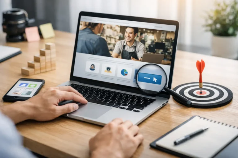
The Fix: You need a "Primary Call to Action" (CTA) that is impossible to miss. It should be in the top right corner of your header and right in the middle of your "Hero" section (the top part of your site).
Make the button a contrasting color. If your site is blue, make the button orange. Use action-oriented text like "Get a Free Quote" or "Book Your 30-Minute Call." In fact, you can see a great example of a direct CTA right here: Book a meeting with us.
4. Being a Digital Hoarder (Information Overload)
We get it: you do a lot of cool stuff. But if your homepage is a wall of text, fifteen different fonts, and twenty-five different images of your team at the Christmas party, you’re overwhelming your visitors.
Decision fatigue is real. If you give a visitor ten things to look at, they will often look at nothing.
The Fix: Embrace whitespace. Your homepage should be a guided tour, not a scavenger hunt. Use clear sections, bullet points, and high-quality images that support your message. If you want to see how a clean, conversion-focused site looks, take a peek at our results page.
5. Moving Slower Than a Sunday Morning
In 2026, nobody has patience. If your website takes more than three seconds to load, half of your visitors are gone. Search engines like Google also hate slow sites, which means your SEO optimization for small business will suffer if your site is bloated with massive, unoptimized images.
The Fix:
- Optimize your images (don't upload 10MB files!).
- Use a fast hosting provider.
- Consider a website maintenance service to keep things running smoothly.
Every second you shave off your load time can directly increase your conversion rate. It's one of the easiest ways to get more leads without even changing your marketing.

6. The "Desktop Only" Delusion
Most people will probably find your business while scrolling on their phones during a lunch break or while waiting in line for coffee. If your website looks like a scrambled puzzle on a mobile screen, you’re basically telling half your audience to go away.
The Fix: Mobile-first design isn't a "nice to have" anymore; it’s a requirement. Buttons need to be big enough to tap with a thumb (no tiny links!). Text needs to be readable without zooming. If you haven't checked your own website on your phone lately, go do it right now. We'll wait.
…Back? If it was a struggle to navigate, it's time for an update.
7. Being a Ghost (Zero Social Proof)
People are naturally skeptical. They want to know that you are a real business that actually delivers on its promises. If your homepage has no testimonials, no logos of past clients, and no reviews, you’re a "ghost."
The Fix: Sprinkling social proof throughout your homepage is like adding fuel to your lead machine.
- Testimonials: Use real quotes from real customers.
- Case Studies: Show the "Before" and "After."
- Trust Badges: Show that you're certified or part of local business groups.
If you don't have reviews yet, go ask three happy clients for a quick sentence about their experience today.
Bonus Tip: Use AI Tools for Business Automation
Since we're all about working smarter, not harder, why not let a robot handle the initial greeting? Adding a simple AI chatbot to your homepage can capture leads while you're at dinner or at the gym. It can answer basic questions ("Do you work on weekends?") and direct people to your booking link. This is a huge part of turning a static site into a 24/7 lead machine.
How to Get Started Today
Turning your homepage around doesn't have to happen all at once. Start with the "All About Me" trap: change your main headline to focus on your customer. Then, move that "Contact" button to a place where it can actually be seen.
If looking at your website makes you want to hide under your desk, don't worry. Most small business owners feel the same way until they get a professional strategy in place.
At CFGROOVE, we specialize in taking the stress out of the digital world. Whether you need a brand-new affordable web design or you want us to handle your website maintenance service so you never have to think about load speeds again, we’ve got your back.
Ready to stop losing leads?
Let’s chat about how to fix your homepage and get your business grooving. You can reach out to us in two ways:
- Pick a time on the calendar: Book a 30-minute discovery call here.
- Send us a good old-fashioned email: Reach out to Chase directly at chase@cfgroove.com.
Your homepage should be your best salesperson. If it’s currently your worst, let’s get it promoted!