Picture this: You’re a plumber out in the field. You’re standing in a damp crawlspace, your boots are caked in mud, and you’ve got one hand on a leaky pipe. You need to check a spec or look up a local supplier on your phone. You pull it out, hit a website, and, BAM. You’re squinting at text so small it looks like a swarm of ants. You try to click "Contact Us," but your thumb hits the "Privacy Policy" instead because the buttons are packed together like sardines in a tin.
If you’ve felt that frustration, imagine what your customers feel when they’re trying to hire you.
In the world of service-based businesses, whether you’re in HVAC, landscaping, or roofing, your website isn't just a digital business card. It’s your hardest-working employee. But if that employee is showing up to the job site "squished," you’re losing money.
Today, we’re going to talk about the difference between a site that is truly mobile-friendly and one that is just "mobile-squished," and why that distinction is the difference between a ringing phone and a silent inbox.
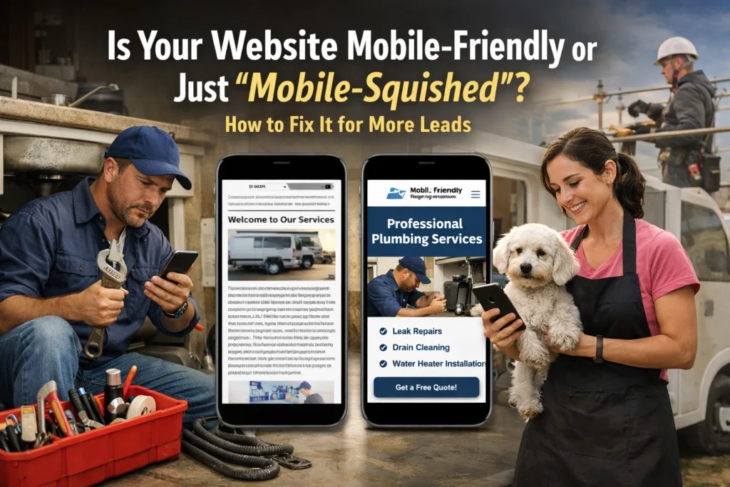
What on Earth is a "Mobile-Squished" Website?
Let’s get the terminology straight. Back in the day, websites were built for big desktop monitors. When smartphones took over the world, some folks didn't want to rebuild their sites. Instead, they just used a bit of code that tells the browser, "Hey, take this giant 1920-pixel-wide design and cram it into this 400-pixel-wide phone screen."
The result? A mobile-squished site.
It’s technically "on" your phone, but it’s just a miniature version of the desktop site. To read anything, the user has to do the "pinch and zoom" dance. It’s like trying to read a billboard through a keyhole.
On the flip side, a mobile-friendly (or responsive) site is smart. It knows it’s on a phone. It rearranges itself. The sidebar moves to the bottom, the three columns of text turn into one easy-to-read column, and the buttons grow large enough for a human thumb to actually hit them.

Visual Description: A close-up of a contractor’s hand, calloused and dirty from a day's work, holding a smartphone on a job site. The screen clearly shows a clean, single-column website layout with a large, bright "Call Now" button that is easy to tap.
Why "Squished" is Killing Your Lead Flow
If you are a service pro in the USA, your customers are usually finding you in a "micro-moment." Their AC just died in the middle of a Texas July. Their basement is flooding in Ohio. They aren't sitting in a mahogany-rowed office on an iMac. They are stressed, they are on their phones, and they are looking for a "Call" button.
If they have to zoom in to find your number, they’re going to bounce. In fact, if your site is one of those 5 brutal website mistakes that are costing you business, a bad mobile experience is likely #1 on the list.
Google also hates squished sites. They use "mobile-first indexing," which is a fancy way of saying they look at your mobile site first to decide where you rank. If your mobile site is a mess, your SEO is going to tank faster than a lead pipe in a swimming pool. Check out our SEO category for more on that.
How to Tell if You’re "Squished" (The Fat Finger Test)
You don’t need to be a tech genius to see if your site is failing the mobile test. Just grab your phone and try these three things:
- The No-Zoom Challenge: Can you read every word of your homepage without zooming in? If the answer is no, you’re squished.
- The Fat Finger Test: Try to click a link in your menu. Did you hit the right one on the first try? If you accidentally clicked the link next to it because they were too close, your site isn't mobile-friendly.
- The Loading Race: Turn off your Wi-Fi and use your cellular data. Does the site load in under 3 seconds? Service pros often work in areas with spotty reception. If your site is bloated with giant images that haven't been optimized, your customer will give up before the first picture of your van even loads.
4 Fixes to Turn "Squished" into "Friendly"
If you realized your site is currently a squished mess, don't panic. You don't necessarily have to set the whole thing on fire and start over (though sometimes a fresh web design is the best medicine). Here is how we fix it:
1. Adopt a Responsive Layout
This is the gold standard. Instead of fixed widths, responsive design uses percentages. It tells the site, "Fill 100% of whatever screen you are on." This ensures that whether someone is on a massive desktop or a tiny iPhone SE, the content flows naturally. This is a huge part of the evolution of UI design: moving away from static boxes to fluid experiences.
2. Boost the Font Size and Line Height
On a phone, 12pt font is a death sentence. You want your body text to be at least 16px. Also, give the text some room to breathe. Increase the "line height" (the space between lines) so people can scan your services while they’re walking or working.
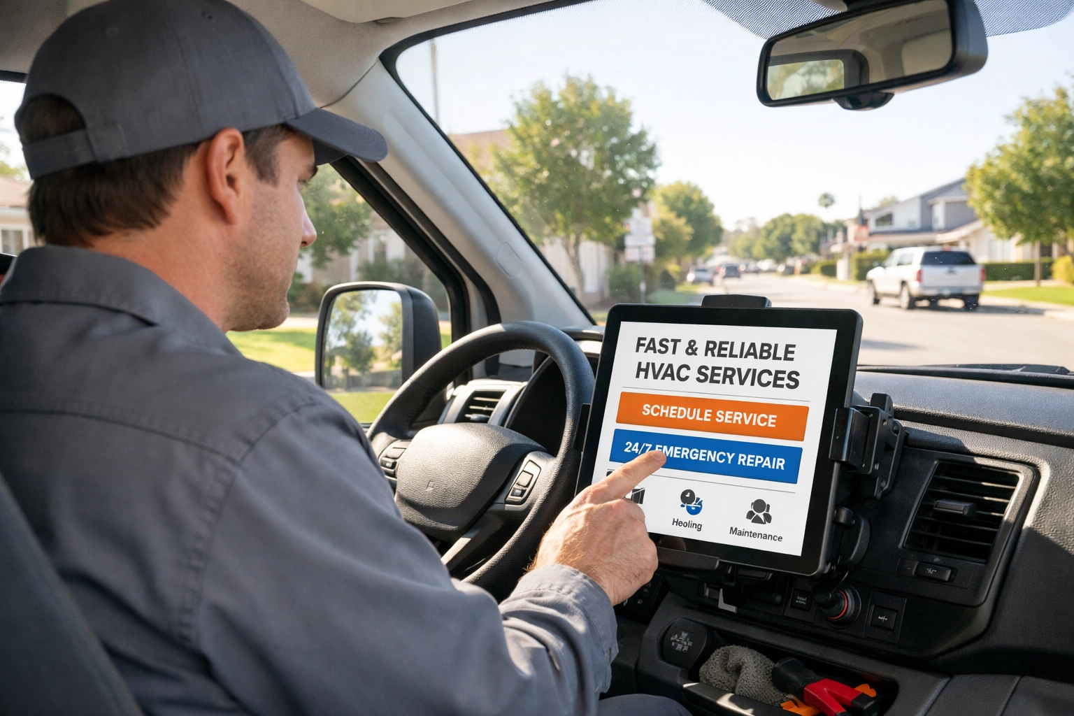
Visual Description: An HVAC technician sitting in the driver’s seat of a branded service van, looking at a tablet mounted on the dashboard. The tablet shows a clear, high-contrast website with large, readable text.
3. Make Your Buttons "Clickable" (Literally)
Apple and Google both recommend that touch targets (buttons) be at least 44×44 to 48×48 pixels. You also need "white space" around them. If your "Get a Quote" button is touching your "Home" link, you’re going to have some very frustrated potential customers.
4. Prioritize the "Action" Content
On a desktop, you might have a long story about your grandfather starting the business in 1954. That’s great for building trust, but on mobile, that story shouldn't be the first thing people see.
Mobile users want three things:
- What do you do?
- Are you near me?
- How do I call you?
Put your phone number and a "Request Service" button at the very top (the "header"). As we mentioned in our guide on 5 quick Google Business Profile fixes, making it easy for people to contact you is the #1 way to increase leads.
The Speed Factor: Don’t Let Your Images Bloat Your Business
We see this all the time: A contractor takes a beautiful, high-resolution photo of a finished kitchen remodel on their iPhone. They upload that 10MB photo directly to their website.
On a desktop with fiber internet, it looks great. On a phone in a suburban driveway with two bars of LTE? That image takes 15 seconds to load.
Mobile-friendly sites use "compressed" images. They look just as good to the human eye, but they are 90% smaller in file size. If your site is slow, it’s one of the 10 reasons your small business website isn't getting leads.
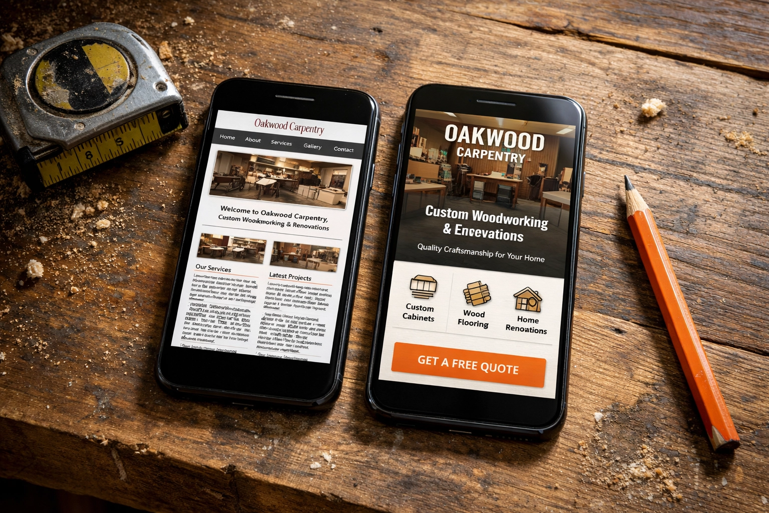
Visual Description: A split-screen comparison. On the left, a "mobile-squished" site where the text is tiny and unreadable. On the right, a "mobile-responsive" version of the same site with a clear "Call Now" button and easy-to-read headers.
The Bottom Line
Your website is often the very first interaction a customer has with your brand. If that interaction involves them squinting, zooming, and cursing their "fat fingers," you’ve already lost the job. You’ve signaled to them that you don't care about the details: and in the service industry, details are everything.
Stop settling for a site that was designed for 2012. Your customers are on their phones, looking for someone they can trust right now.
Is your website helping you close the deal, or is it just getting in the way?
If you’re tired of looking at a "squished" version of your business, we can help. At CFGROOVE, we build sites that work as hard as you do, especially on the devices your customers actually use.
Ready to stop the squinting and start the calling?
Let’s chat. You can book a 30-minute discovery call with us here or shoot an email over to chase@cfgroove.com. Let’s get your site looking as professional as the work you do.

Visual Description: A business owner in a high-visibility vest standing in front of their company truck, smiling and talking on their phone, looking confident and successful.