
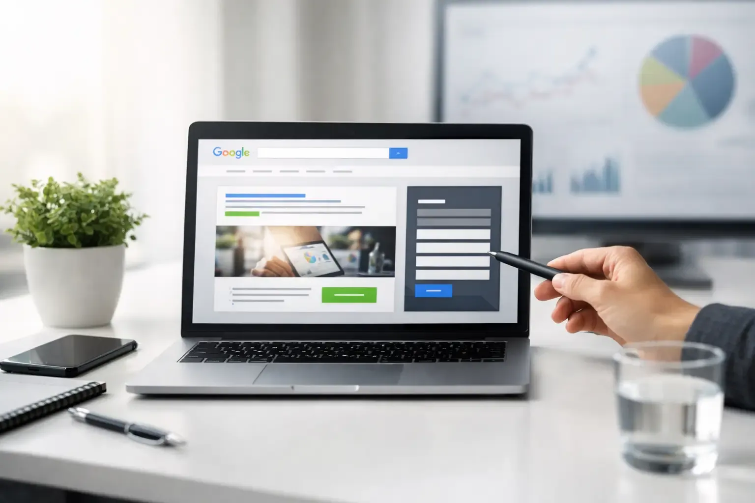
A Google Ads click can cost $10, $30, or much more depending on your industry. If that visitor lands on a generic homepage, has to hunt for the right service, and leaves without contacting you, you paid for attention but did not create an opportunity. That is why Google Ads landing pages matter so much for small businesses.
A landing page is not just another page on your site. It is a focused sales page built around one campaign, one audience, and one next step. For a plumber running ads for emergency repairs, that next step may be a phone call. For a commercial cleaning company, it may be a quote request. The job of the page is to make that action feel obvious and low-friction.
Why your homepage is rarely the best destination
Your homepage has a big job. It may introduce your company, list several services, show your service area, tell your story, and give visitors multiple ways to get in touch. That is useful for people who found you through a referral, Google search, or a social post.
Paid ad traffic is different. Someone who searches “roof repair near me” has a specific problem right now. Sending them to a homepage that talks broadly about roofing, gutters, inspections, and company history forces them to do extra work. Every extra choice gives them another reason to leave.
A strong landing page continues the conversation started in the ad. If the ad promises same-day AC repair in Fort Worth, the page should lead with same-day AC repair, explain who it helps, show the service area, and make calling or requesting service simple. The headline, offer, and call to action should feel connected from click to contact.
This does not mean every campaign needs a completely separate website. It means the page should match the intent behind the search. One well-built service page can support a tightly related group of keywords. A campaign for residential kitchen remodeling, however, should not land on the same page as a campaign for commercial build-outs.
What high-converting Google Ads landing pages include
The best pages are clear before they are clever. A visitor should understand what you offer, where you offer it, and what to do next within a few seconds.
A headline that matches the search
Your first headline should name the service and, when relevant, the location or customer type. “Fast, Reliable Water Heater Repair in Arlington” is stronger for a paid search visitor than “Quality Service You Can Trust.” The second phrase could apply to almost any business. The first confirms the visitor landed in the right place.
Matching does not mean repeating keywords awkwardly. Write like a helpful business owner speaking to a real customer. The goal is relevance, not stuffing “water heater repair” into every sentence.
A clear reason to choose you
Small businesses often know their advantages but bury them halfway down the page. Put the practical differentiators near the top: licensed technicians, fast response times, free estimates, transparent pricing, financing options, years in business, or specialized experience.
Be specific whenever possible. “Family-owned since 2008” is more believable than “the best service in town.” “Quotes returned within one business day” gives a prospect a real expectation. Vague claims can still have a place, but they should not carry the whole sales message.
One primary call to action
A landing page should have a main goal. For many local service businesses, that is a call button and a short form. For a higher-ticket project, it may be a consultation request. Keep the language direct: “Request Your Estimate,” “Schedule Service,” or “Talk to a Project Specialist.”
You can repeat the same call to action throughout a longer page. That is not pushy. It saves the visitor from scrolling back up once they are ready. What hurts conversion is presenting five competing actions, such as booking, downloading, subscribing, browsing services, and following social accounts all at once.
Proof that reduces hesitation
Ads get the click. Trust gets the lead. Add proof close to the decision point, especially when a visitor is considering a form submission or phone call.
Useful proof can include short customer testimonials, review ratings, before-and-after project photos, certifications, recognizable client logos, insurance details, warranties, or a simple explanation of your process. A home services company may show completed work. A B2B provider may highlight outcomes, industries served, or a brief case example.
Use proof that fits the offer. A beautiful photo gallery may help a landscaper or remodeler. It does less for an emergency locksmith than a prominent phone number, hours, response expectations, and strong reviews.
A form people will actually complete
Long forms quietly waste ad spend. If your first conversation only requires a name, phone number, email, and a short description of the need, do not ask for a full street address, budget range, preferred color, and seven other details.
There are exceptions. A detailed project questionnaire can help qualify leads for custom construction, legal services, or complex commercial work. But ask only for information your team will use immediately. You can gather the rest after the lead is in the door.
Design for mobile visitors first
Many paid clicks happen on phones, particularly for urgent local searches. A page that looks great on a desktop can still fail if the call button is tiny, the form is frustrating, or the content takes too long to load on mobile data.
Check the page on an actual phone. Can someone call you with one tap? Is the main offer visible without endless scrolling? Are the form fields easy to use? Do pop-ups block the screen? These basic details affect real leads more than a flashy animation ever will.
Speed matters, too. Large uncompressed images, too many tracking scripts, and overloaded page builders can slow a page down. You do need conversion tracking for your campaigns, but you do not need every marketing tool under the sun attached to one page. Keep the build clean and purposeful.
Build the campaign and page together
A common mistake is treating the ad account and the website as separate projects. The campaign manager selects keywords and writes ads. The website is already there, so traffic gets sent wherever there is a relevant-looking page. That approach can work, but it leaves money on the table.
Start with the offer. What service are you promoting? Who is searching for it? What concern or outcome drives the search? Then build the ad, keyword group, and page around that same answer.
For example, a dental office might run one campaign for emergency dental care and another for cosmetic veneers. The emergency page should emphasize quick availability, clear instructions, location, and a call button. The veneers page can spend more time on results, consultation details, financing, and photos. Both campaigns serve the same business, but the visitors are making different decisions.
This alignment also helps Google evaluate relevance. When the keyword, ad copy, and landing page all point to the same service, you are giving both the visitor and the ad platform a clearer experience. It will not fix a weak offer or an uncompetitive budget, but it is a foundational part of running efficient ads.
Track leads, not just clicks
A campaign with lots of clicks can look busy while producing little revenue. The measurements that matter are phone calls, submitted forms, booked appointments, qualified inquiries, and eventually closed business.
Set up tracking so you can see which campaigns produce those actions. If possible, separate calls from form submissions and track booked appointments or qualified leads in your CRM. A form fill from someone outside your service area is not the same as a ready-to-buy customer.
This is where trade-offs come in. A page with a very short form may create more leads but lower quality. A page that asks for project details may generate fewer inquiries but better ones. There is no universal winner. The right setup depends on your sales process, average job value, staff capacity, and how quickly your team follows up.
Fast follow-up is part of landing page performance. If you pay for a lead at 10:00 a.m. and call back the next day, the prospect may already have hired someone else. Make sure notification emails work, calls are answered, and someone owns the next step.
Test changes with a business goal in mind
You do not need to redesign a landing page every month. Start with the obvious friction points: unclear headlines, slow loading, weak calls to action, missing proof, or forms that ask too much.
Then test one meaningful change at a time. Try a clearer offer, a more direct button label, a shorter form, a stronger review section, or a different lead image. Give the change enough traffic to tell you something. Judging a page after 12 clicks usually leads to random decisions.
At CFGroove, the goal is not to make an ad landing page look like a trendy design portfolio. The goal is to help a local business turn paid traffic into conversations with people who need its services. Clean design matters because it makes the message easier to trust and act on.
Your next paid click is already expensive. Give it a page that answers the visitor’s question quickly, proves you are a solid choice, and makes reaching out feel like the easiest decision they make all day.